For the highest quality printed CDs, DVDs, or Blu-Rays, you will undoubtedly want to choose silkscreen printing. We can print up to four solid colours, or full colour CMYK if you wish to print a photograph or gradients. Designing silkscreen print artwork is a little different from designing album artwork, as colours will have to be separated for us to use the proper ink. Here are some tips for designing silkscreen disc artwork!
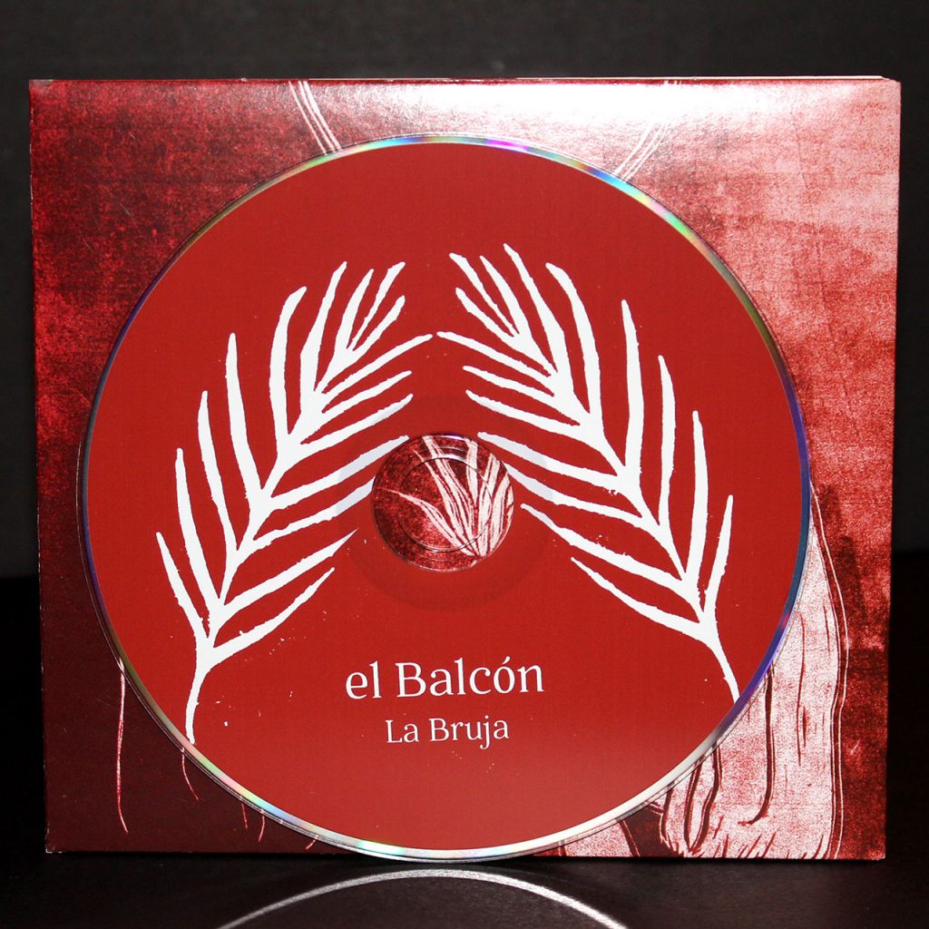
 An example of 2-colour silkscreen printing
Don’t Use Photoshop
While many of us who have dabbled in graphic design are most comfortable using Photoshop, we do not recommend it in the case of silkscreen disc design. You should be using Adobe InDesign, Adobe Illustrator, or CorelDraw. The main reason is that instead of using layers or colour fills like you would in Photoshop, you’ll want to instead use Pantone swatches. Which brings us to our next point…
Start Using Pantone Colours
Pantone is an organization system for a wide range of colours. Each pigment or tint is assigned an alpha-numerical identifier, so for example Electric Blue would be Pantone 2727c. Ideally, as a graphic designer you would refer to a Pantone swatch booklet which would have every colour number, that way you’re not reliant on a computer monitor whose colour calibration may be a little bit off.
By using Pantone swatches in Adobe InDesign, Illustrator, or CorelDraw, we know exactly which ink colour to use. Your desired hue of blue won’t be too bright or dull, for we know to use the 2727c ink. If you don’t use Pantone swatches, you will need to tell us which pantone number to use for each colour.
How to find Pantone swatches in Adobe Illustrator
Separate the Colours
Let’s say you chose 2-colour silkscreen as your disc print option, and you’d like a red design against a black background. You can’t simply send us a rasterized or flattened jpeg with your artwork, these two colours need to be separated from one another. Simply having each desired colour on a separate layer will not suffice, we must be able to remove colour channels for the whole file like in the video below. Please note that white counts as a colour, empty space in artwork will reveal the silver disc.
High Resolution Text
We recommend adding the text through InDesign, which will give it the sharpest quality and highest resolution possible. If your text is stylized (stretched, bent in a circle, etc.), we recommend Adobe Illustrator as that is the ideal program for vector graphics.
CMYK Printing is a Different Story
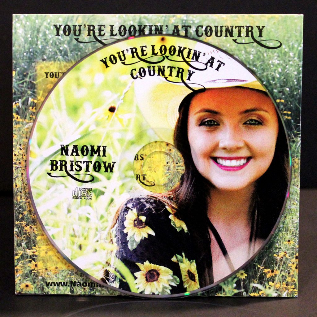
If you have a photograph you’d like to use for the disc artwork, maybe a picture of the band or a broken down Chevy, you’ll want to use full-colour CMYK. The approach to CMYK printing is much simpler, it doesn’t require any colour separation or Pantone matching. Simply place the high resolution image in the template and that should suffice.

An example of full CMYK printing
Use Our Templates and Hire a Designer
If this is your first rodeo to graphic design, you may want to look for outside help. A professional designer will have all the tools and knowledge to complete the job. We also offer graphic design services, and since we’ll be the ones printing the discs we’re going to get it right on our first try. Don’t forget to supply your artwork using the Duplication.ca templates!
You may find this guide to be a bit overwhelming, but it’s the road you need to take for brilliant and beautiful silkscreen disc printing. All of the above are industry standard guidelines, which allows us to provide you with the highest quality printed silkscreen so your album artwork is as loud as your music.
CLICK HERE TO ORDER PROFESSIONAL CD PRESSING WITH BEAUTIFUL SILKSCREEN PRINT


